8 Greatest Examples of Church Logos of 2023
In 2022, pew research center estimates that out of five, at least one churchgoer attends services online. It says that more than ever, religious firms can currently place themselves to reach worshippers online and give virtual services.
Therefore, a solid online branding strategy built around it is one of the finest methods to increase your church’s online visibility. One minor but crucial element of this is the design of a church logo. A well-designed logo will help your worshipers stand out, attract attention, and leave a lasting impression on potential and current members.
Logo Magicians, the best creator of corporate logos in the USA going to provide you with some advice in this post to help you give you a solid examples that support you to create the visual brand identification of your church.
1. Lynwood Church
Church logos frequently use crosses since they are popular in religious groups. However, there is no correct or incorrect method to display this famous religious symbol. Lynwood Church is an excellent example of how to design an abstract church logo employing a novel idea of a well-known symbol.
There are two components to the white cross-shaped emblem. The design features a double-L shape positioned upright in the top-right corner and a reversed version of the same symbol that points to the bottom-left.
2. Menai Anglican Church

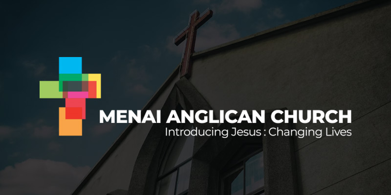
Another religious institution that has developed an ambiguous understanding of the cross is the Menai Anglican Church. Blue and green, yellow and orange, and pink and red are vibrant colors used in this construction to create an eye-catching impact.
The overlapping shapes make a preliminary version of the cross. The logo was created with the intention that the church welcomes anyone to join during the spiritual journey. The emblem indicates that you don’t have to be a particular kind of person or christian to worship. Everyone is welcome.
3. Fincastle Baptist
In religious branding, mountains are a recurring image. And just as various styles represent the cross, there are multiple approaches to the idea of a mountaintop.
For instance, the geometric image of a cross on a hilltop appears in the white-and-black church emblem for Fincastle Baptist. One of the church’s guiding principles is to grow as a community; an inspirational symbol like the cross is put on top of an aspirational symbol like a mountain.
If you want to create meaningful and honest relations with parishioners and the local community or to create company branding, then use stunning church logo design by connecting with Logo Magicians. They are the best monogram logos and corporate logos makers for any industry. So, don’t wait and create genuine links with your worshippers.
4. North Point Community Church
You can design a logo for your church to stand out among the other churches in the neighborhood. While there are exciting and imaginative ways to play with conventional religious symbolism (such as the cross, mountain, Bible, and fire), it could be worthwhile to consider other possible meanings for your own church’s logo.
For instance, the North Point Community Church uses color to reflect the church’s name in its logo. Four directional arrows are displayed inside a white and orange double-lined circle. White surrounds the others, with the one pointing north being orange. However, it gives members a sense of security by instructing them to travel north to find and join us. However, it doesn’t express anything about this organization’s religious beliefs.
5. World Changers Church International

World Changers Church’s logo is an excellent illustration of advanced iconography used in a church. The globe icon is located over the church’s name. Here you can view the continents of America in blue, and to the right, you can catch a glimpse of Europe.
The letter mark and the symbol can both stand alone and still provide the church with a powerful, recognizable identity, which makes this logo interesting. Consequently, this logo can be used across the church’s marketing materials, making it highly versatile.
6. Immanuel Church
The church logo of Immanuel Church incorporates geographic iconography. It is split into an independent sign and an independent letter mark, both of which will still be easily recognizable. It is no accident that the cityscape is built with a church at its core. Its goal is to unite people, and this church serves the area. This idea is exemplified by the church that dominates the city’s center.
7. The Grove
The Grove has a strong logo and is a contemporary, vibrant church. This place is not merely a church; it also offers several ministry initiatives, a coffee shop, counseling services, and online church services.
The logo’s large size and hand-drawn design instantly grab the attention of everybody who sees it thanks to the soft, peaceful gray-and-white color scheme. Additionally, the combined type case (“GROVE” in all caps and “the” in all lowercase) conveys a fascinating, dynamic impression. It undoubtedly resembles a logo you’d find on the outside of a trendy new restaurant or coffee shop rather than a church, and for sure, this contemporary vibe will attract new members.
8. Gospel Grace Church

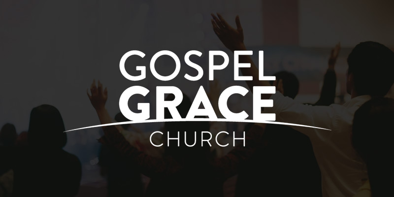
At first look, the “Grace” and “Church” phrases of this church’s logo appear to be essential letter marks connected by a curving line. You’ll see that the design has a more profound significance after you learn more about the church’s purpose. Gospel, The goal of Grace is to liberate people from loneliness and darkness. The arc of light and the distinct letters above it represents the sun rising and illuminating the earth and all its inhabitants.
Conclusion
A church requires a strong visual identity—honest, trustworthy, and memorable to make genuine connections with its members and the neighborhood. Here, the logo serves as the foundation of this identity.
So contact Logo Magicians that provide the best monogram logos and company branding to make the connection more vital than ever. Chat with them to explore your desired church service logo designs.


